Project Type
Branding
Y&S Wealth Management
Y&S is an upcoming wealth management firm. They wanted to be market ready and get their branding done before launching. the purpose was to provide a one stop financial solution to their clients. They wanted the logo to convey that they have their foot in all aspects of finance.
Phase 1
Ideation
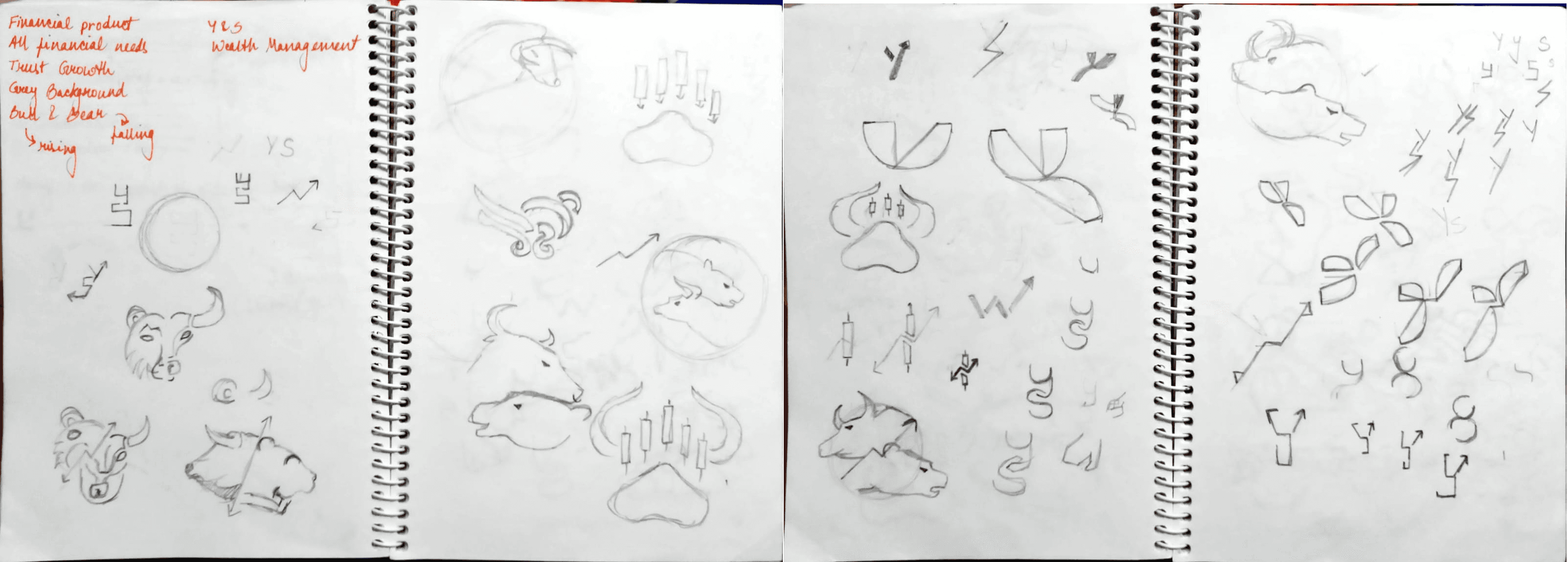
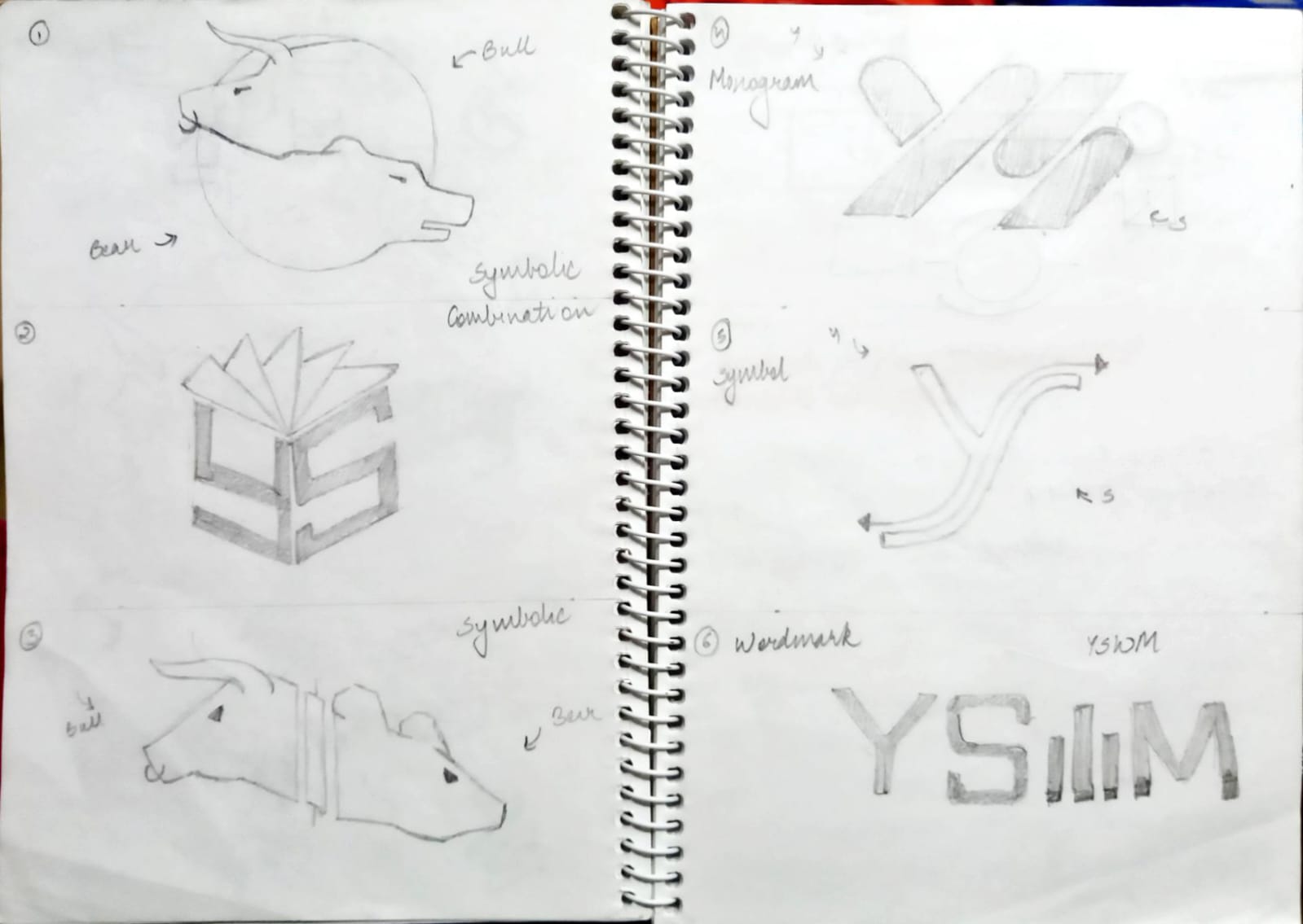
The client had some ideas of their own. Such as having a grey background (refernaced from owner's numerlogy), using a bull and bear if possible. Key words - trust and growth. I used this information as an anchor and starting creating some rough ideas. I tried different logo types and approached each one. I felt the need of a symbol as the name in itself was too long and they would need a compact version for small collateral prints.
Challenges
Designing a logo for Y&S proved to be more challenging that I expected. ⦁ The Y&S represented the initials of two names, and I had to avoid showing either letter rising or falling (as a stock reference) because that would have altered the intended meaning of the name. ⦁ The logo had to be unique. With an immense number of competitors in the market, the company needed to stand out. The logo had to make an identity for itself in a way that the name was recognisable.
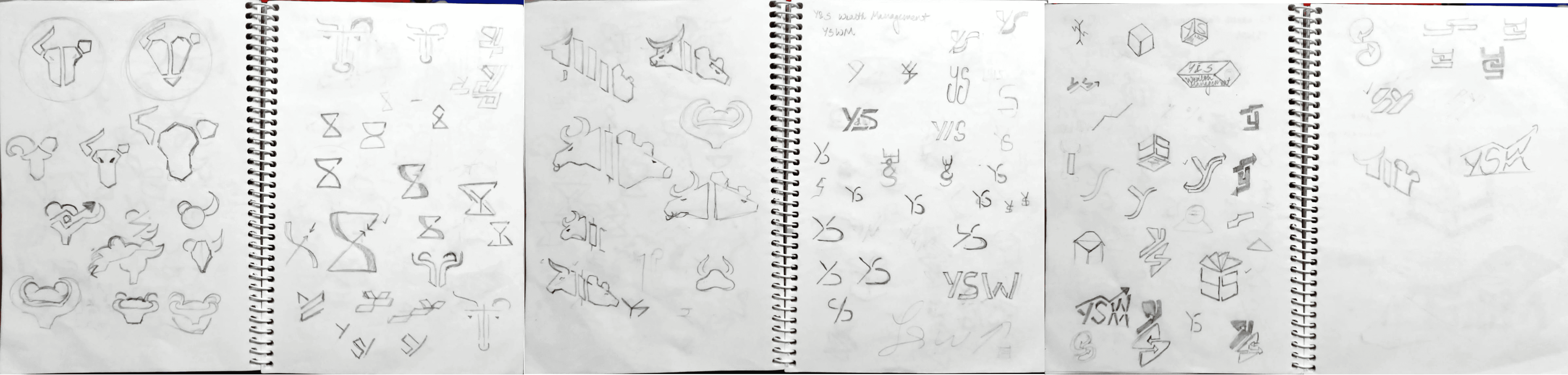
Shortlisting
The best 6 sketches were taken and translated into options fo the client. Each option explained the type of logo and the meaning/ interpretation of each logo.
Phase 1 - Reflection
Digitization
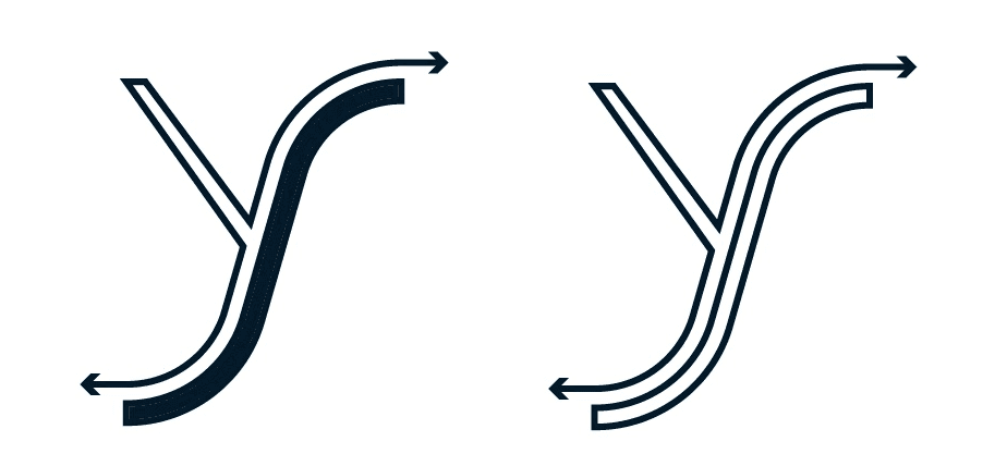
Out of the 6 given concepts, the 4th one was chose. I wasn't happy with the options I had presented and the one client had chosen but still tried digitizing it. The Logo was almost complete but I did not feel a spark in the design. It didn't feel like my design and didn't match the brief according to me.
Reflection
I knew I had to do something about this. This was going in a direction I did not want and if I am not saftisfied with the design. I cannot convince my client to be either. So I set up a meeting to discuss the way forward. We had a healthy discussion about the current concept and the way forward. While we were at it, we also chose the color scheme, trying to incoporate the grey which they wanted So what went wrong? ⦁ The chosen direction was too direct and did not reflect the brand's purpose. ⦁ The logo needed to be expandable for variations of use ⦁ The logo should be something people will understand and relate to a wealth management firm. ⦁ The logo doesn't need to be so boring, it can be playful and still convey the message.
Phase 2
Redesign
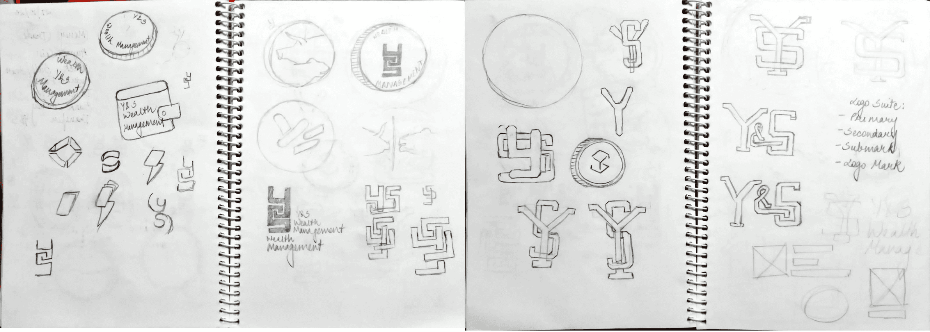
After my reflection, I started designing again. This time I listed down things I wanted to incorporate. I wanted to try something more direct but still unique. The idea of a coin was really intruiging because it allowed customers to understand what the company is about and can be personalized to resemble currency.
Digitization
I then took the concept into Adobe Illustrator and started to vectorize. It took me a couple of tries until I got it right. While designing, I realized that I was again going into the loophole. I wanted to add some extra elements, wanted the coin to have different faces on each side, wanted to keep designing different versions of the logo. Until I realized I did not need to over complicate this. A few neat options would do just the trick and the coin can be as it is without having 2 faces. After all, the client does require a 2D logo.
Final Design
Logo Suite
I ended up making a logo suite for the brand. This included an emblem which served as a primary logo. A horizonatal and vertical logo and symbolic version which can be used in small scale prints or as favicons. I also created a simplified version of the logo which can be used in petterns and really small scale prints. This will make the logo more clear as the details won't be visible in small scale designs.
Color Palette
The inspiration for colors came from crypto UIs. They often had a broad spectrum of colors so they can show their stats easily and colors that would stand out and merge well together. I wanted to create a palette which would incorporate the grey but not be muted. I ended up making 3 versions and here is the chosen pallete.
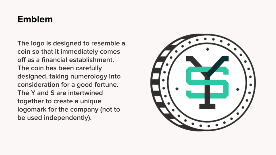
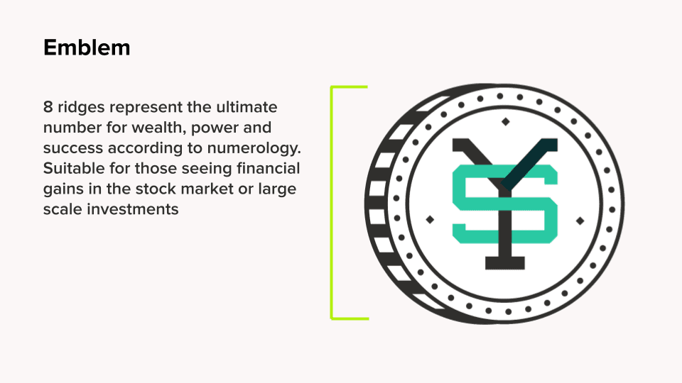
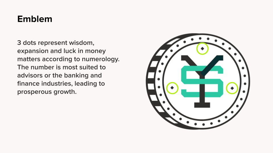
Logo Symbolism
Since the owner was inclined towards numerlogy, I decided to incorporate some more elements which would strengthen the power of this logo for them.